Dole brings color. dole brings joy. dole brings brightness.
dole brings a little lift to the world every time they show up.
dole’s fun, fruity, sunny, joyful, vibrant, bright and big. Dole is big.
Which is to say:
Fruit’s Big.
Dole wanted to make
They asked for a new portfolio worthy expression of their brand across social - and in my eyes, beyond. The only way to do that is to create something that would stop the scroll and be a ownable - immediately and permanently identifiable alongside one of the nation’s most recognizable brands.
So, I pitched em ⌄this ⌄
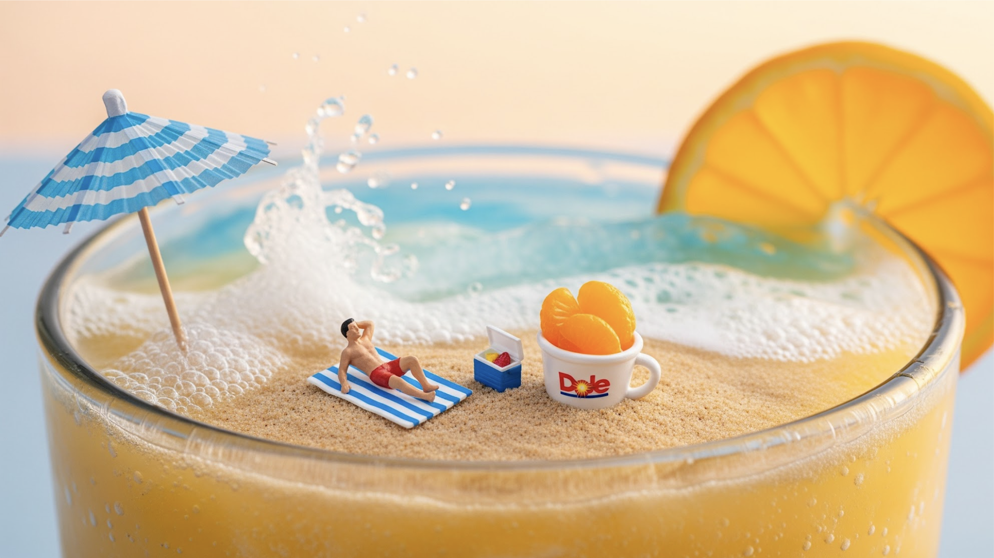
“Fruit’s Big” is a matter of perspective.
Perspective on the world, on the people in it and the thing that Dole brings to all of us: joy by way of fruit, in many shapes and sizes. That’s a perspective that we can own and is uniquely Dole.
The aesthetic is charming surrealism told through miniature worlds captured with practical stills and animation, macro and heroic low angle food photography, sun-streaked lighting and a brand voice that emphasizes
total fixation on how sunny Dole makes life feel.

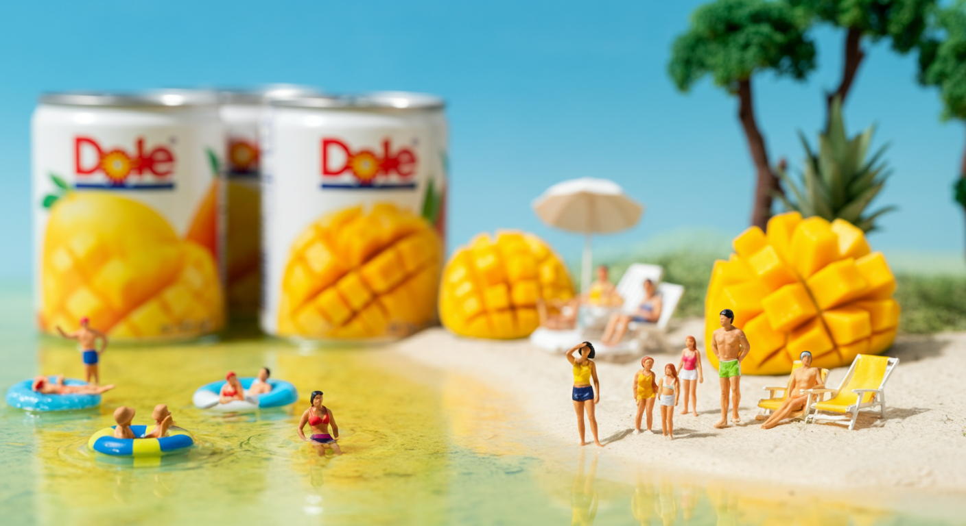
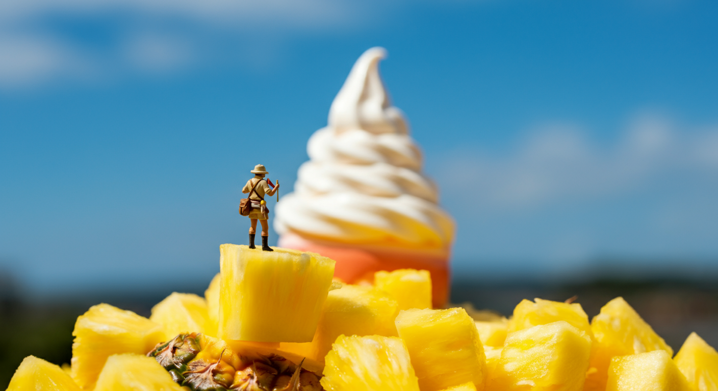
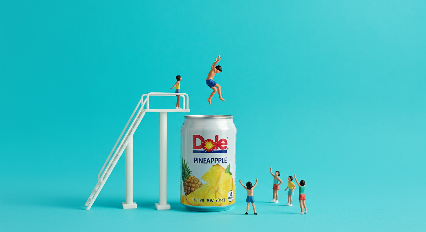
Artful, charming vignettes that center the aesthetic of Fruit’s Big with winsome miniatures, always juxtaposed against the big, beautiful bright fruit that Dole delivers.
This content bucket is how we show up and speak to culture, share our perspective on the world, seasonal behaviors and win hearts with eye-catching visuals meant to share sunshine.
These ideas exist to do what most CPG brands fail to do:
make people feel something. A visual identity that can drive saves, shares and engagement with beautiful, fun visuals - creating love for Dole, an ownable aesthetic and staying power in the hearts and minds of anyone who sees them.